Design · Graphics/3DJan – Apr 2025
Capsule.
Memories you walk through instead of scroll: photos and messages locked until a chosen date, then opened inside a 3D gallery.

Overview
Memories, locked in 3D, revealed in time
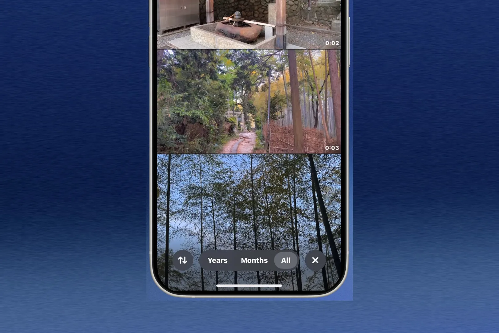
Capsule is a time capsule you open rather than scroll through. You fill it with photos and messages, pick a date, and it stays sealed until then. When it opens, the contents do not appear as a grid — they arrive in a 3D gallery you move through.
The problem
A filing cabinet nobody reopens
We started from a question everyone answers badly: when did you last look at a photo more than a year old? Phones store everything and surface almost none of it. A camera roll grows faster than anyone can read it, so the memories with the most weight end up buried deepest.
Today's memories are stored like files. We wanted them stored like stories — something with a beginning, a wait, and an opening. That reframe became the brief: how might we turn digital memories into something playful and emotional, worth reliving and worth sharing?
Design
Designing around the moment of reveal
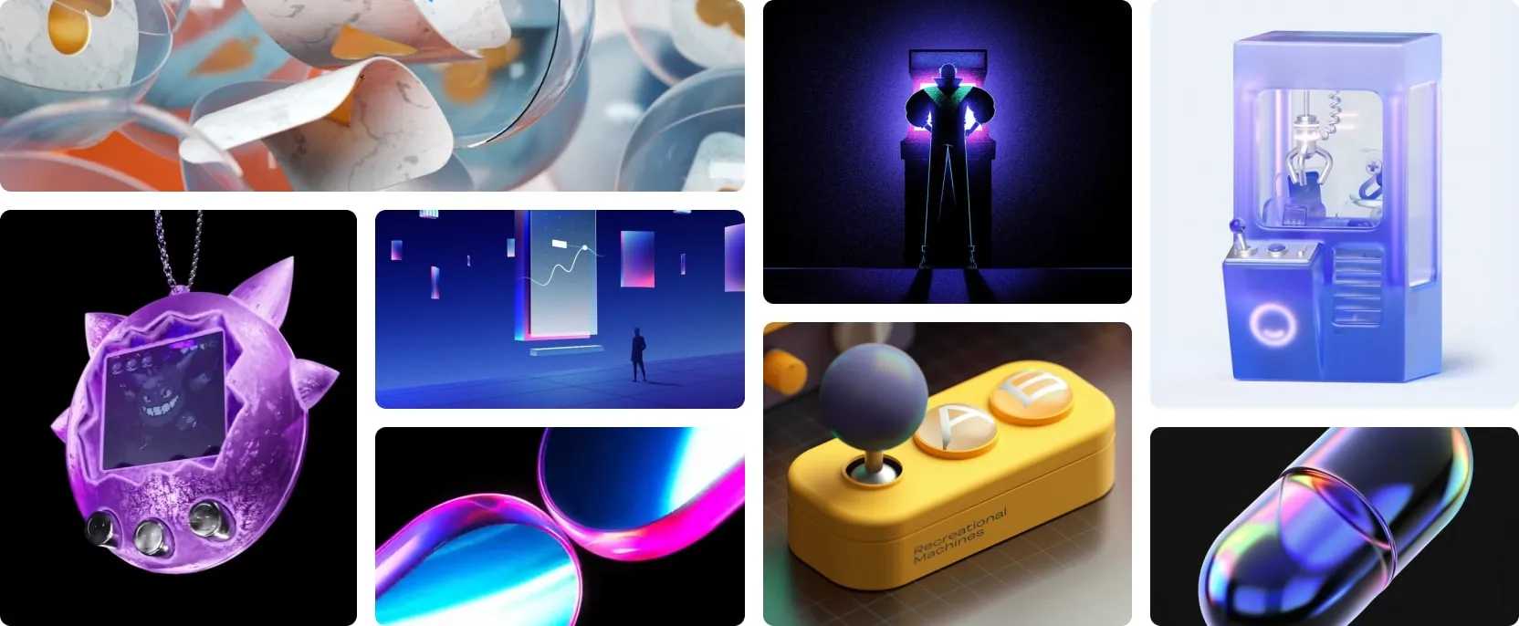
The answer we kept circling back to was the gachapon machine. You turn a dial, a capsule drops, and you have no idea what is inside until it cracks. The value sits in the delay, not the contents. That gave us an interaction model and a visual language at once, and it is where my part of the project started.
I designed the product around one moment — the opening — and worked backwards from it, so each phase had to earn the next.
- Creating: a plain, form-driven flow. Deliberately quiet, so the weight sits in what you put in rather than the interface around it.
- Waiting: the capsule exists as an object you can see and turn but not open — visible and withheld at the same time.
- Opening: the capsule cracks and its contents spill out into the gallery.

3D
Modelled in Blender, animated in Spline
The 3D was mine to make. I modelled the machines and capsules in Blender, then rebuilt the hero capsule in Spline so it could be animated and handed over as something the developers could embed directly rather than a spec they had to reimplement from a video.
Designing in the tool the build would actually consume changed what I could propose. The reveal animation was drawn against what the runtime could afford, instead of being thrown over a wall and quietly cut down later.
The product


Structure


Reflection
Restraint is what makes the reveal land
The decision I would defend hardest is the quiet one. It would have been easy to make every screen as loud as the gachapon render, and the pull to do it was constant. Keeping the creation flow plain is what makes the opening land — a payoff stops reading as a payoff if everything before it is already one.
Outcome
Credits
- EmmiDesign lead
- BryanDesigner
- NondDesigner
- ShauryaDeveloper lead
- LoriDeveloper
- LukaDeveloper
- XimingDeveloper