DesignApr 2026
Wikipedia Redesign.
Redesigning the world's largest encyclopedia around how people actually read it.
Overview
Redesigning Wikipedia for how people actually read
Wikipedia is where most research begins, but its mobile experience hasn't kept pace with how people consume information: scanning rather than reading, jumping between sections, expecting summaries before committing to depth.
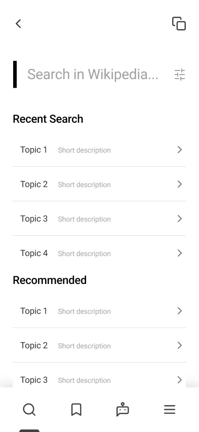
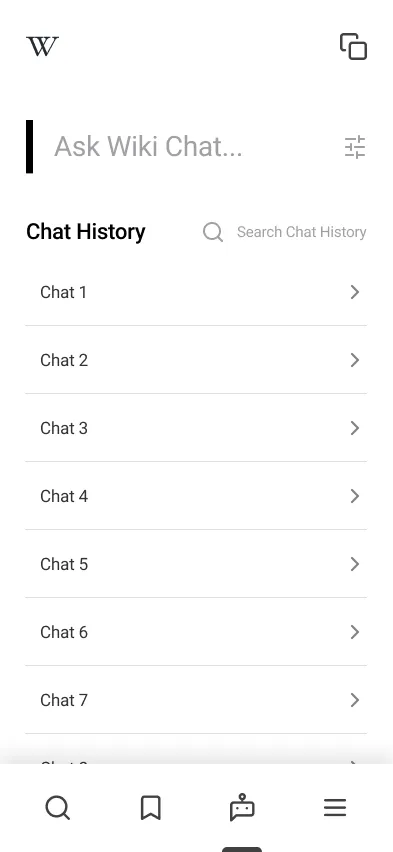
This was a personal project: a complete research-to-prototype redesign of Wikipedia's mobile interface. Structured interviews, a survey, insight and How-Might-We synthesis, lo-fi wireframes, usability testing with four participants, and a hi-fi prototype across five sections: Home, Article, Search, Language, and an AI Chat feature.
Concept
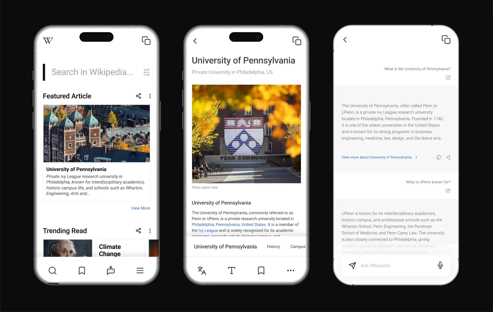
Problem
Built for encyclopedias, not for people in a hurry
Wikipedia's mobile app functions — but functioning isn't the same as working well. Several structural mismatches surfaced between what the interface offers and how people move through information:
- Dense, unstructured text: long articles with little hierarchy force linear reading; no summary, no way to preview relevance.
- Broken in-article navigation: people rely on Ctrl+F because the built-in section nav is insufficient or invisible.
- Cognitive overload: technical topics sprawl into dozens of sections; without filtering, users abandon to Google.
- Buried language settings: the language toggle is hard to find and ambiguous (app language vs. article language).
- No smart-summary layer: tools like Perplexity surface answers first; Wikipedia offers nothing equivalent.
“I usually just Ctrl+F whatever I'm looking for. I don't actually read the article — I just scan for the part I need.”
Interview participant
Research
How three different users actually use Wikipedia
Three structured interviews across different academic backgrounds (Wharton Finance, College Neuroscience, Engineering CS) covered usage patterns, navigation, pain points, mobile vs. desktop, competing tools, and improvement ideas, with a survey capturing quantitative data.
Findings
- All three use Wikipedia for quick background (skimming, not reading) and lean on Ctrl+F because headers aren't enough.
- Dense terminology drives abandonment to Google rather than persisting through the page.
- Most Wikipedia features (language, TOC, discussion) are effectively hidden: they exist but go unused.
- Mobile is notably worse than desktop: smaller targets, more scrolling, a harder-to-reach table of contents.
Personas
Three readers, one scope
The interviews and survey collapsed into three reader personas and a set of How-Might-We questions that fixed the redesign's scope before any screens were drawn: five sections, each answering a documented need rather than a feature wishlist.
Personas
Structure
Mapping the redesign before the visuals
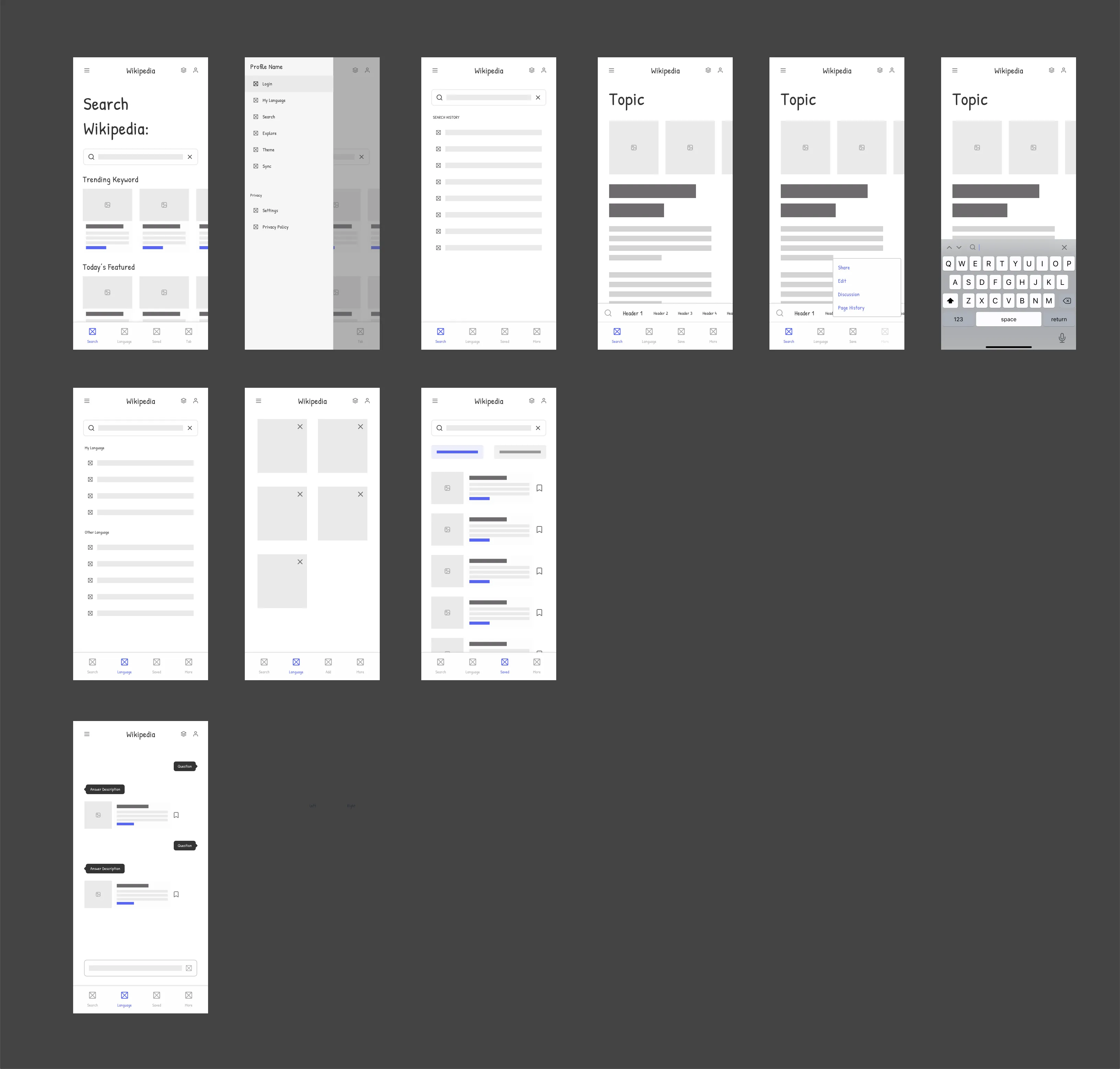
Lo-fi screens set the information architecture before any visual design: a search-first Home with trending keywords and the featured article up front; a persistent, scrollable section-header strip replacing the buried TOC, plus a floating action menu; Language separated and relabeled “Article Language”; and an AI Chat tab as a quick-summary layer over the knowledge base.
Lo-fi
Testing
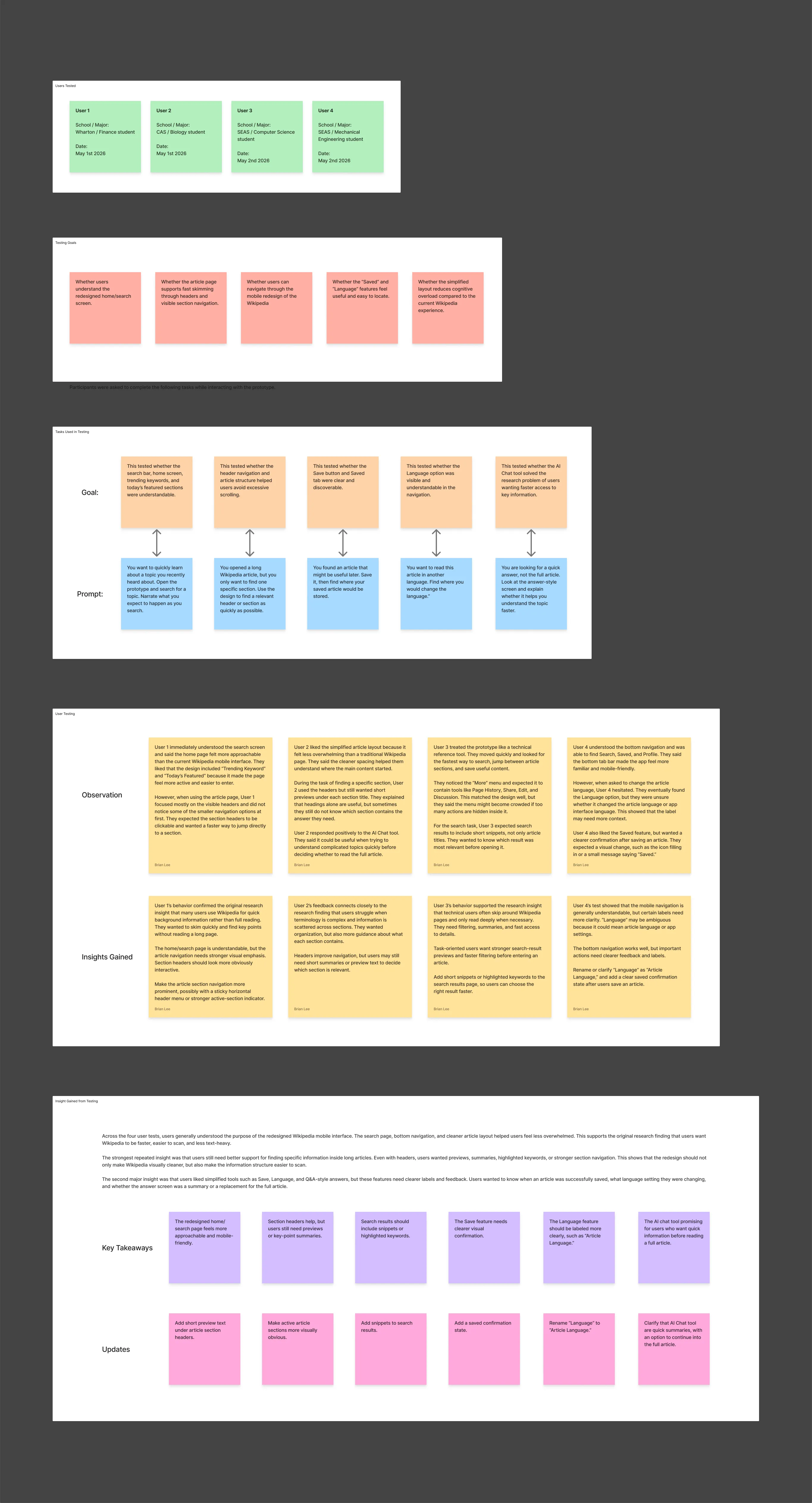
Four users, five tasks, one prototype
Mid-fi prototypes were tested with four participants from different Penn schools, each running five task-based prompts while thinking aloud. The home page was understood immediately; the rest of the design earned its changes the hard way.
Testing
Iterations
What testing changed
- Section previews: nobody would open a section blind, so headers in the strip gained short previews.
- Search snippets: title-only results forced guessing, so every result now carries an article snippet.
- AI Chat framing: participants expected full answers, so the copy reframes it as summaries that link back into the article.
- Article Language: the toggle read as an app setting, so it was separated from Settings and relabeled.
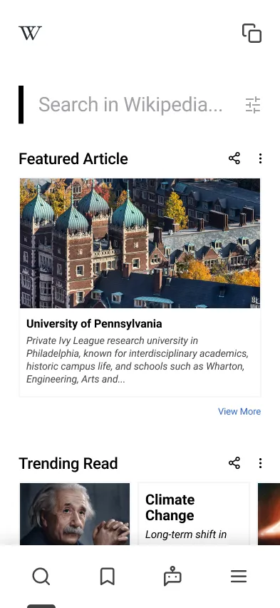
Final design

Reflection
What habituation hides from usability
The biggest lesson was how much habituation masks: people had stopped noticing Wikipedia's friction because they'd built workarounds (Ctrl+F, jumping to Google) into muscle memory. Good usability work means designing for what people actually do, not the coping strategies they've normalised.
Outcome