DesignJan – Apr 2026
Dewey.
Taking a book-discovery startup from web MVP to a working iOS app, as design lead of the Penn Spark client team.
The code and design files belong to the client, so they stay private; the demo below is the working build.
Overview
A real client, a real backend, a real deadline
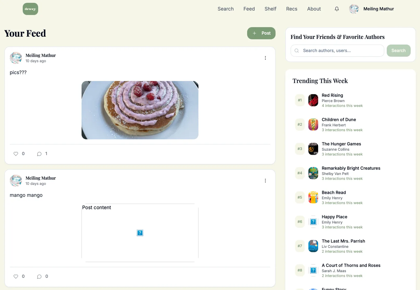
Dewey is a social book-discovery startup founded by two Wharton MBAs: Goodreads-style tracking, taste-based comparative ranking (log a book and it asks whether you liked it more than the last one you loved), short-form reader reactions, and a recommendation algorithm in active development. They came to Penn Spark with a live web MVP, real early users, and one ask: turn it into a production-ready iOS app.
I led design and co-led the project: scoping the design work, owning the UX architecture, running the design side of the weekly client meetings, and carrying the system from wireframes through developer handoff. Two designers worked with me; the developer half of the team built against our specs on Dewey's existing Supabase backend.
Before
The task
Translate, don't reinvent
The brief sounds simple: get the website into app form. The constraints made it design work. Every existing feature had to survive the move to a phone; the visual identity was the client's, not ours to change; the backend and its data model already existed; and the one genuinely new surface, the recommendations experience, had no web version to translate at all.
The process ran in five stages: discovery (web audit, brand review), UX architecture (user journeys, flow charts), lo-fi wireframes for every core screen, hi-fidelity design inside Dewey's brand system, and developer handoff with full Figma specs and prototypes.
Brand
Architecture
Five flows carry the whole product
- Feed: friend posts, trending books, create post, like and comment.
- Search: books and users in one place, book detail, add to shelf, rate and review.
- Recs: daily picks, swipe to accept, calendar history.
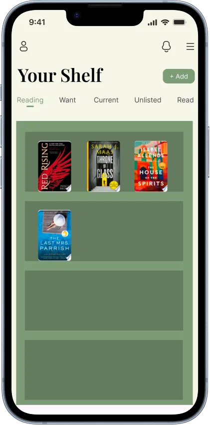
- Shelf: browse, create and rename shelves, track reading by status.
- Profile: bio, reading goals, posts, follow and unfollow.
Lo-fi
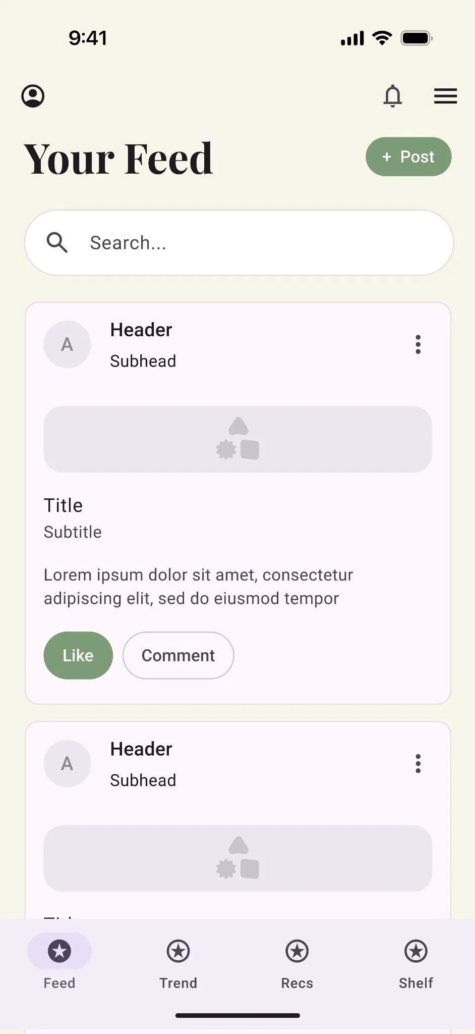
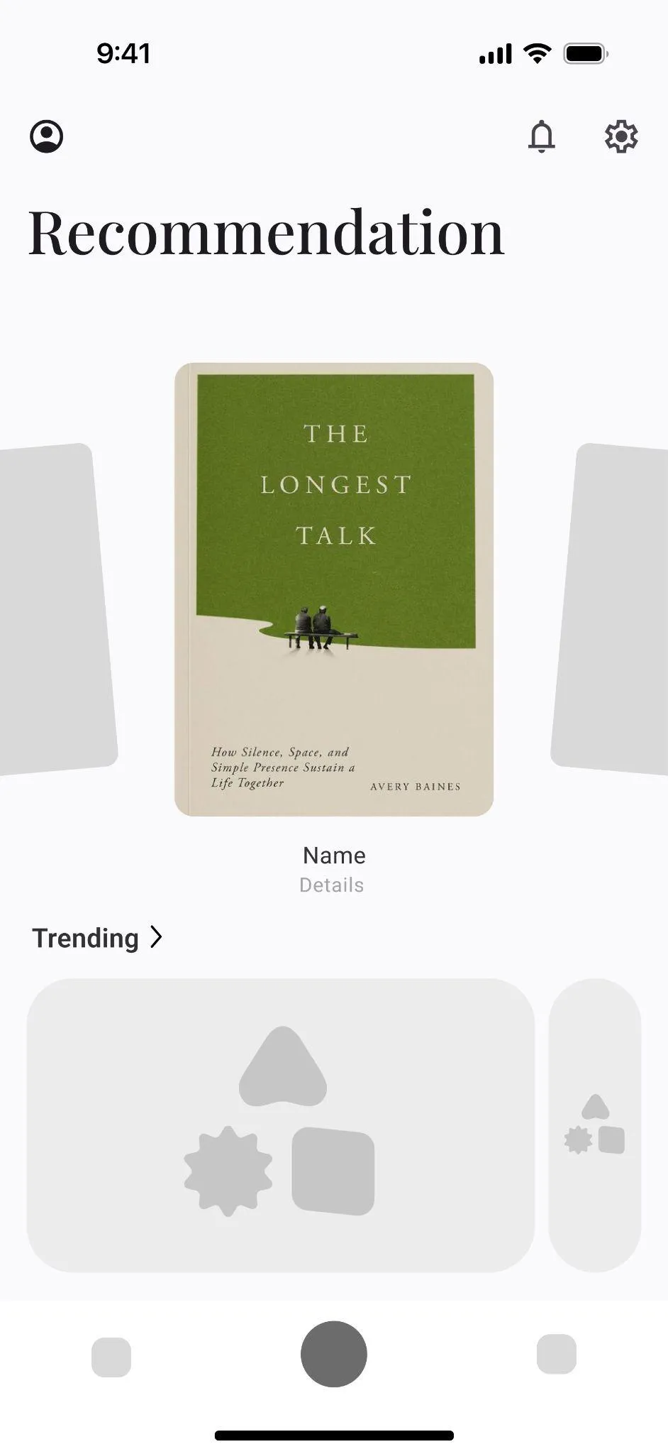
Decisions made cheap, in grayscale
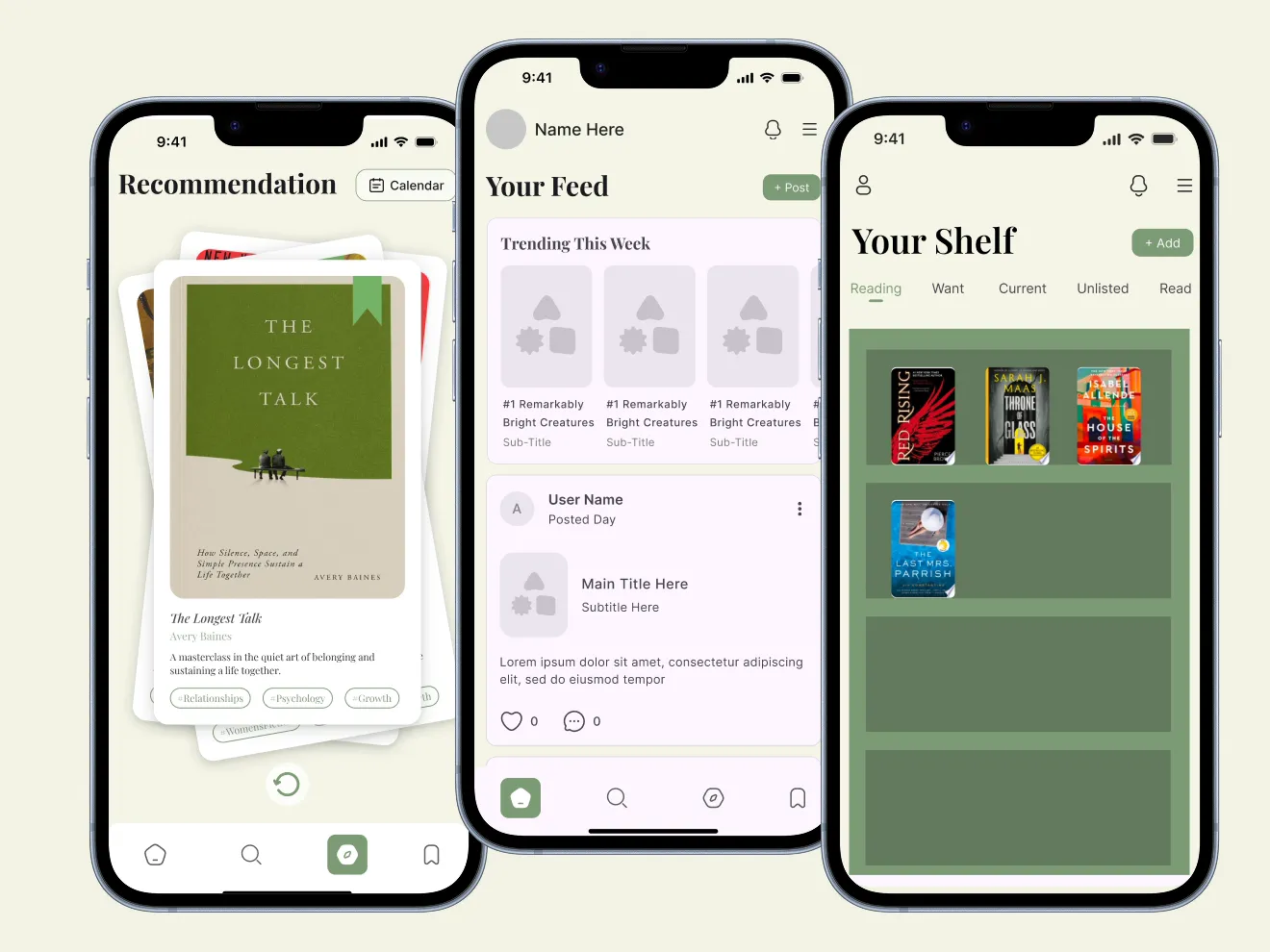
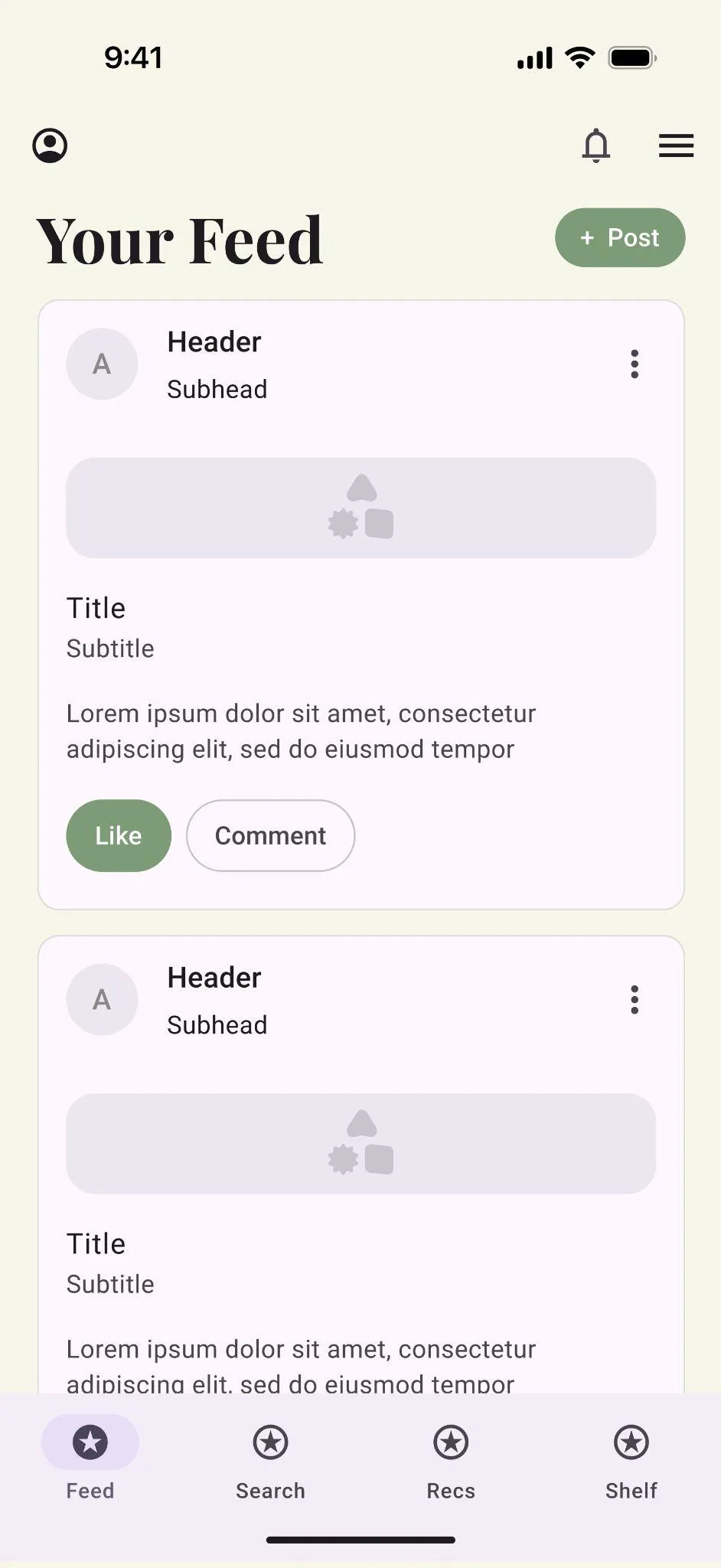
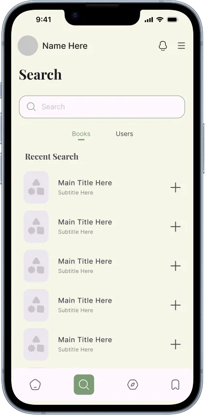
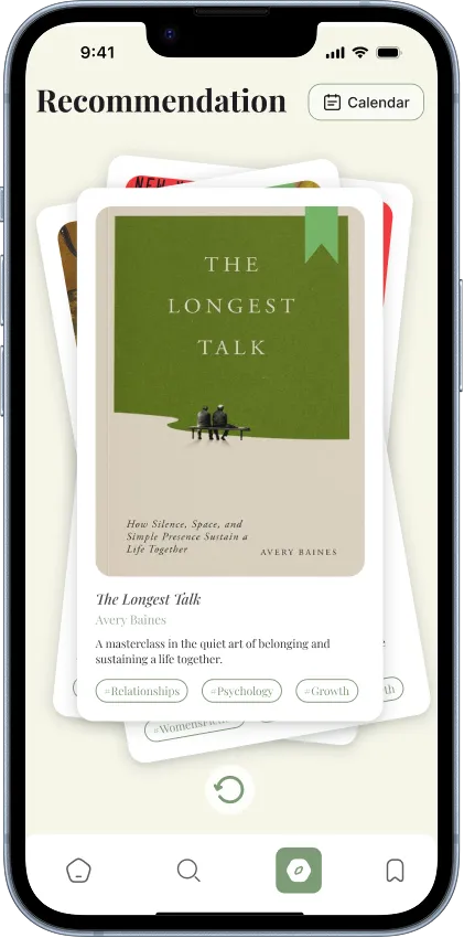
The wireframe round existed to settle arguments before they got expensive. Should search live on the feed or in its own tab? We drew both, benchmarked how Instagram and Spotify structure their home surfaces, checked with the developers that a merged book-and-user search was feasible, and picked the dedicated tab. Should recommendations be a scroll or a swipe? The swipe deck won: it matches the one-decision-at-a-time nature of Dewey's comparative ranking.
Lo-fi
Hi-fi
Mobile composition inside someone else's brand
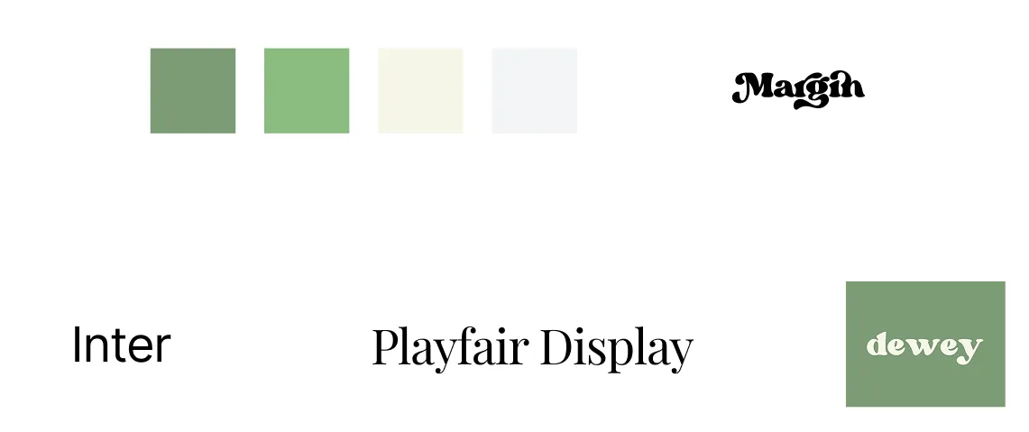
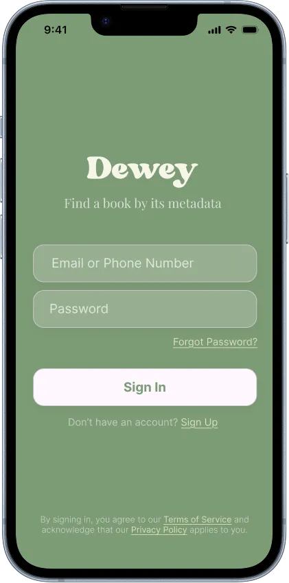
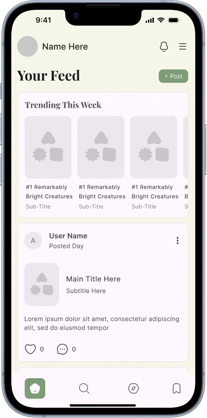
The hi-fi round rebuilt every screen in Dewey's system: Margin for the wordmark, Playfair Display for page titles, Inter for everything readable, the sage-and-cream palette carried from the website. Web features were recomposed for one-handed use rather than shrunk to fit: the feed's trending row became a horizontal shelf, navigation collapsed to four tabs, and the recommendation deck got the swipe-and-flip motion the web never had.
Hi-fi
Shipped
The build is real and people use it
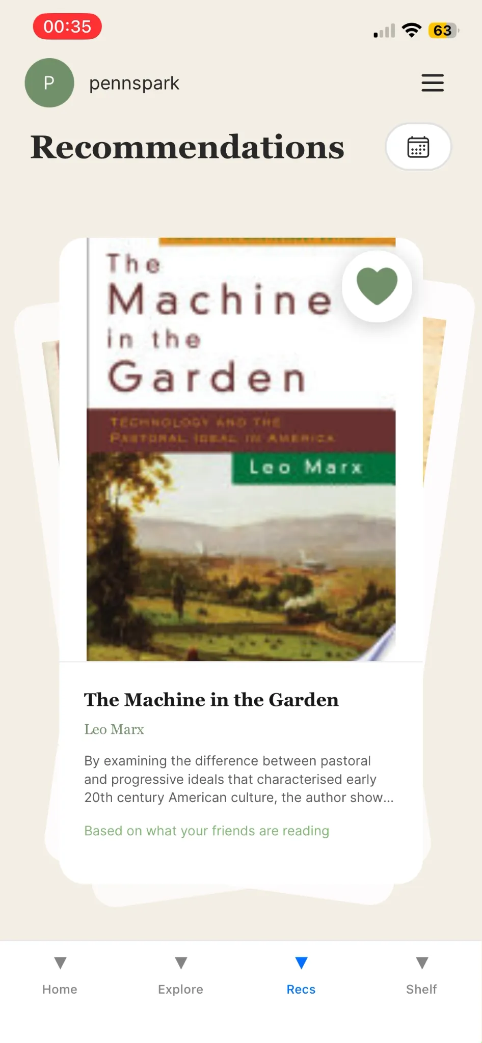
The developers built the app in React Native with Expo on Dewey's existing Supabase backend, wired the recommendation surface to the algorithm the client was developing (embeddings plus LLM-based tagging on their side), and distributed the working build through Expo Go, with the client's founding team and beta testers on it. Designs were iterated weekly against both developer constraints and client feedback until the two stopped disagreeing.
Demo
Reflection
Client design is mostly constraint navigation
This project was less about inventing an interface and more about holding one steady: a brand that wasn't mine, a backend that already existed, two designers to direct, four developers consuming the specs, and founders with opinions and users. The design lead job was keeping all of that coherent, and the weekly rhythm of adjusting hi-fis to what the build and the client actually needed taught me more than the screens did.
Outcome
Credits
- Brian LeeDesign lead & project co-lead: UX architecture, wireframes, hi-fi system, client communication, dev handoff.
- Nond Phokasub · Eve FanDesigners: wireframes, hi-fi screens, and the design kit across the five flows.
- Meiling MathurDeveloper lead & project co-lead: React Native/Expo build, backend integration, recommendations wiring.
- Penn Spark developersJustin, Gordon, Evan, Sylvia, Olivia: screens, endpoints, debugging, deployment.
- DeweyAngela Malinovitch, Doris Wang, Ceylin Erkan: the product, the brand, the backend, and the algorithm.