DesignMar 2026
Path@Penn Redesign
A self-directed UX overhaul of Penn's course-planning portal.
Overview
Path@Penn is the University of Pennsylvania's primary portal for course registration, schedule planning, and degree tracking, a tool every student relies on each semester. Despite its central role, the experience is a dense, fragmented interface that makes planning harder than it needs to be, especially for first-time users.
This was a self-directed project: no client, no team, no brief. The goal: take a platform students use out of necessity, not by choice, and redesign it into something genuinely useful, intuitive, and cohesive.
Problem
A platform that works against its users
The core frustration isn't one broken feature — it's the cumulative friction of many small failures. Four pain points kept recurring:
- Dense, information-heavy interface: too much surfaced at once to focus on the task at hand.
- Fragmented workflows: a single task like adding a course spans multiple pages with no clear thread.
- Unclear registration feedback: after enrolling, it's ambiguous whether it succeeded, failed, or waitlisted, and why.
- Reliance on external tools: students fall back on Penn Course Review, Course Plan, and spreadsheets to fill the gaps.
“I use like four different apps just to plan my schedule. Path@Penn is the last step — I don't actually use it to plan anything.”
Student · informal interview
Research
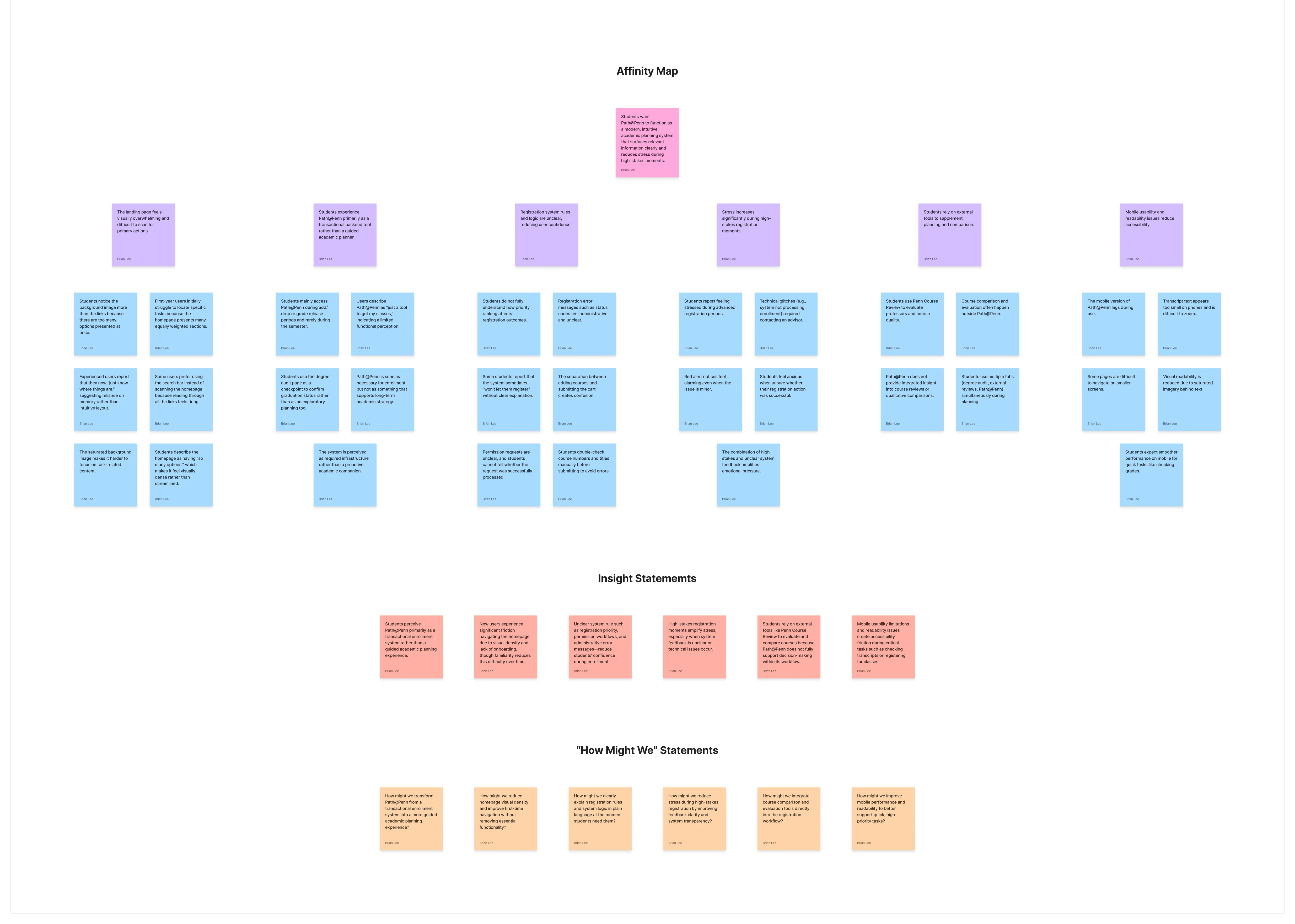
Grounding the redesign in real student behavior
Before touching Figma, I spent time understanding how students actually use the platform, not how they're supposed to, through observational walkthroughs, informal interviews, and a heuristic audit of the existing UI.
Insights
- Students carry a “browse → plan → register → track” mental model; Path@Penn maps to none of it.
- The degree audit, one of the most important planning tools, is functionally hidden.
- Registration feedback (seats, conflicts, prerequisites) is buried in text, not surfaced when it's needed.
- First-years especially report feeling “lost” on opening the portal, unsure where to start.
Research
Process
From lo-fi structure to a high-fidelity prototype
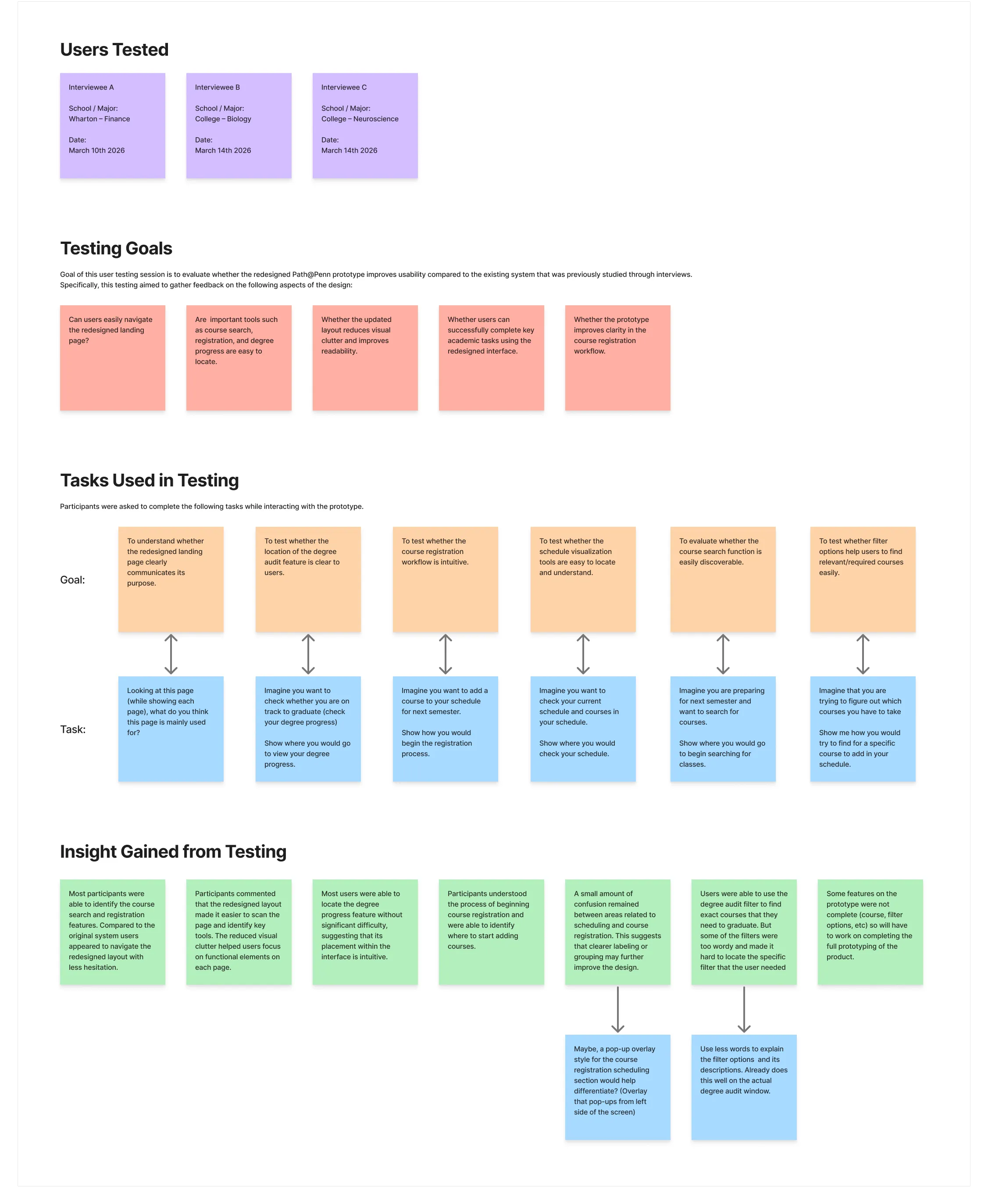
Structure first, visuals second. Lo-fi wireframes worked the information architecture (what lives where, how sections connect, how navigation signals progress) before settling on four sections that mirror how students actually think about planning.
Mid-fi prototypes were tested with peers doing real tasks (find a course, add it, check degree progress) while thinking aloud; that feedback simplified the navigation and made the registration-confirmation state far more explicit. Hi-fi designs were built in Figma on a shared component system (type styles, color tokens, reusable components) so the four sections stay cohesive.
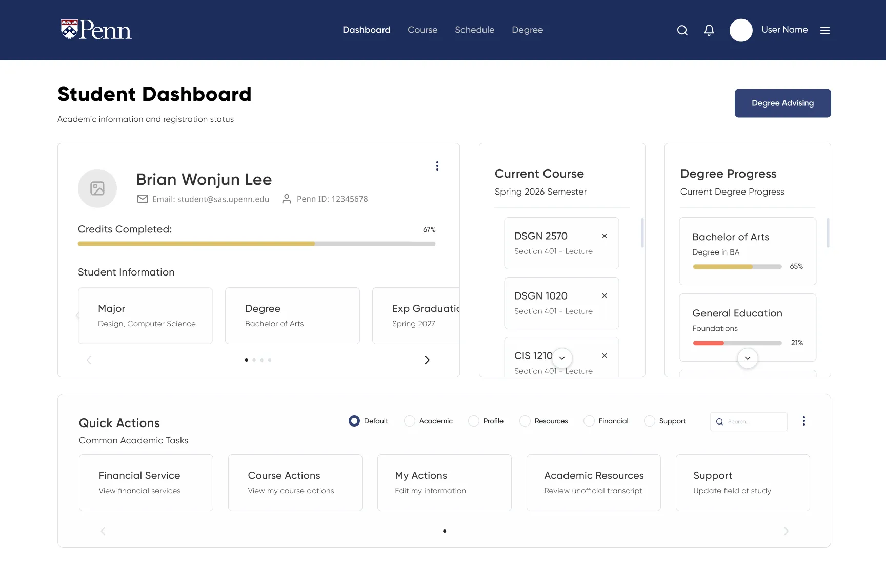
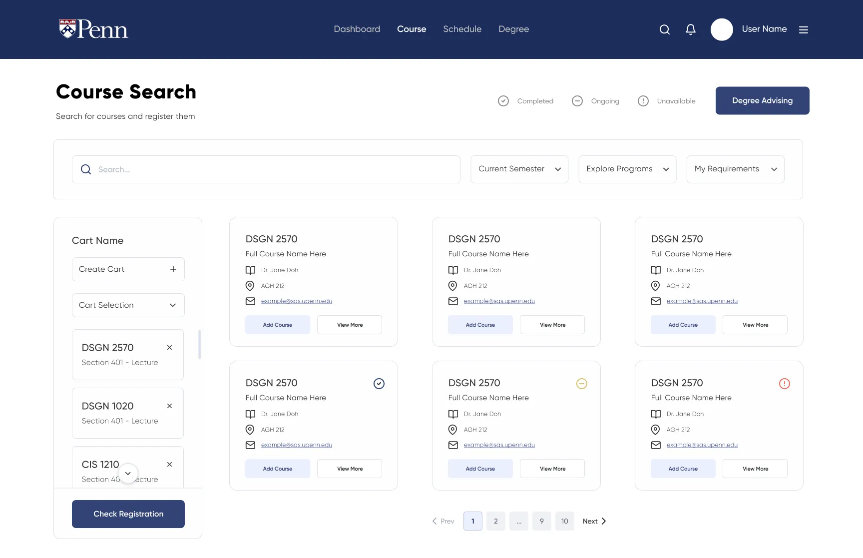
The four surfaces
- Dashboard: a personalized home with deadlines, semester progress, and quick actions up front.
- Course: search-first, live filtering by requirement / schedule / instructor, details expanding inline.
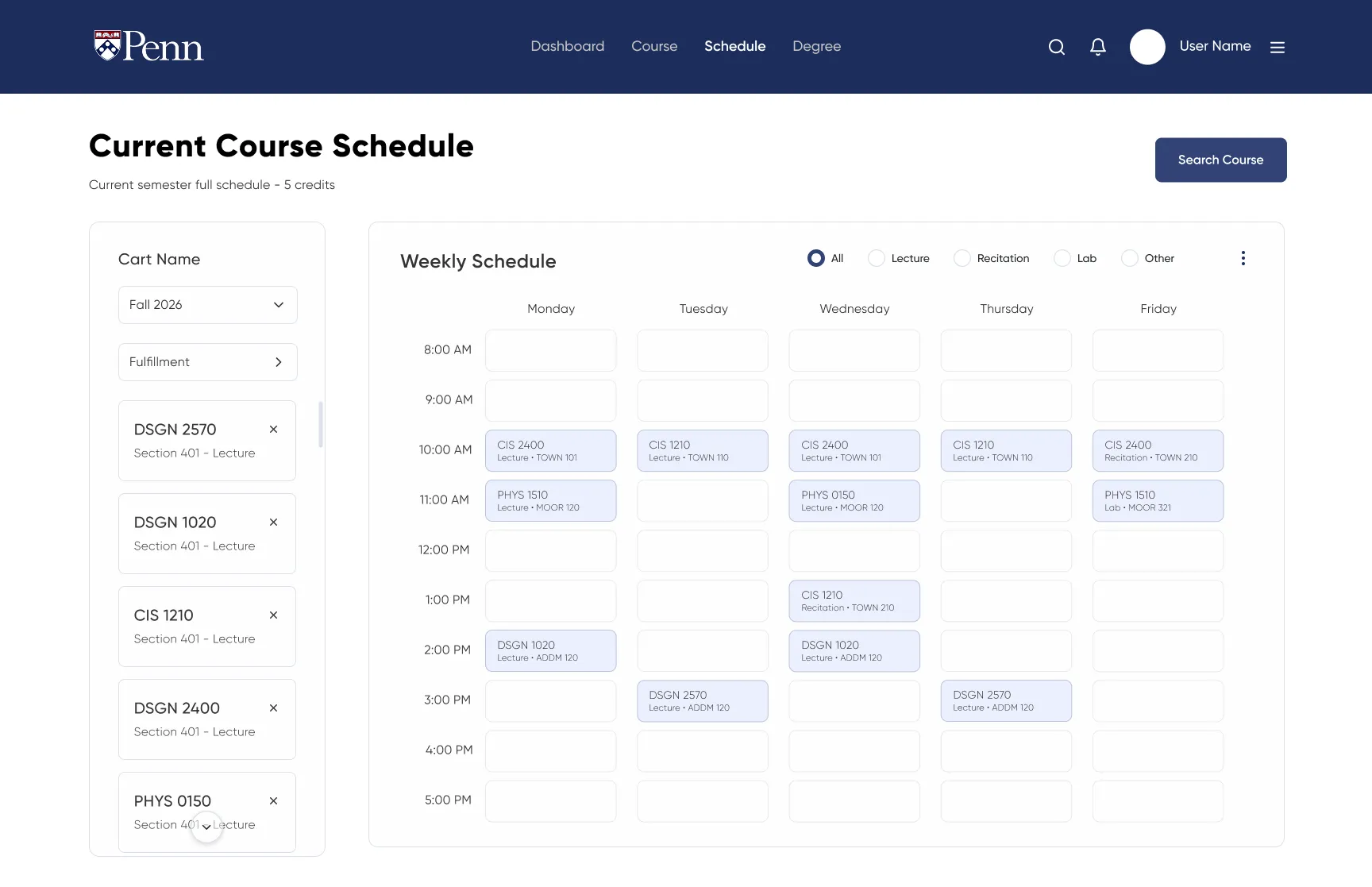
- Schedule: a visual weekly view with real-time conflict detection.
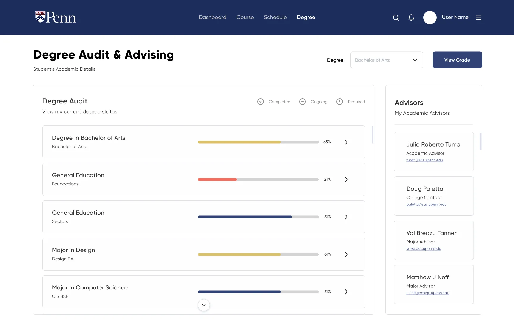
- Degree: a clear visual audit of what's done, in progress, and still needed.
Screens
Outcome
The final prototype is a fundamentally different experience, not by adding features but by reorganizing what already exists into a structure that matches how students plan. It reduces clicks to complete core tasks, surfaces registration feedback at the point of action, and gives students one trustworthy place to see where they stand toward graduation, without a separate app.
Outcome